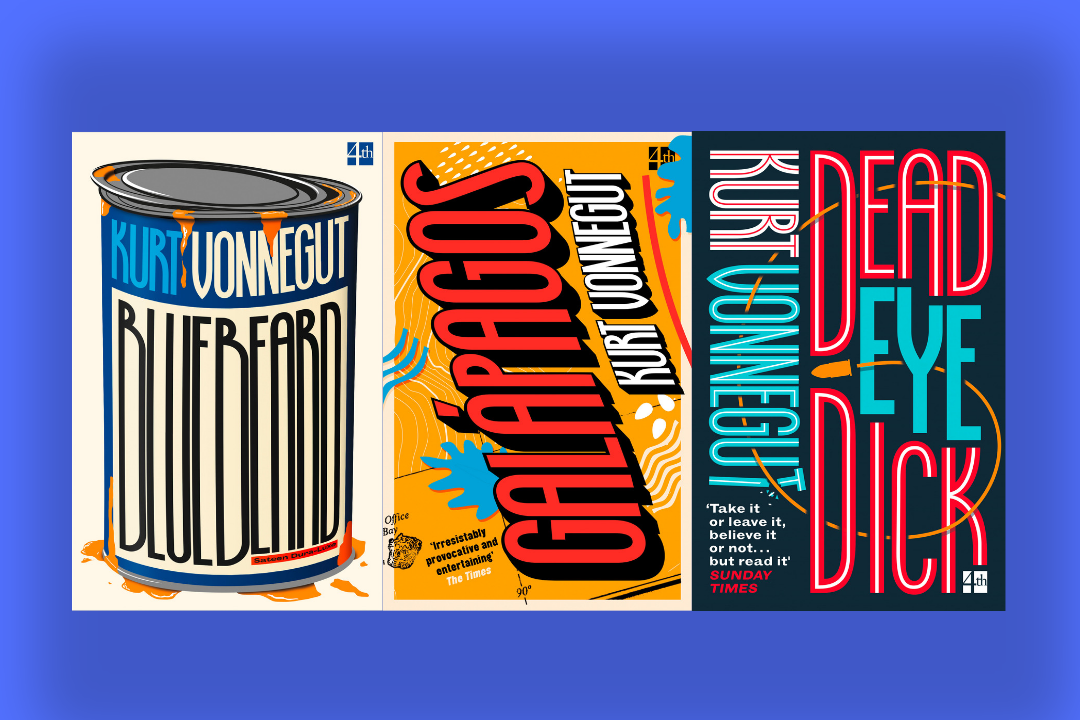
‘ I realised that Kurt Vonnegut doesn’t need an author style or set colours or a grid to create a unified backlist style, he needed a font.’
As a fan of Kurt Vonnegut, I have always been interested in how he is jacketed. How do you design a cover for a writer who is so cross genre, so funny and playful but also so dark and harsh? He was famously peeved for being labeled and marketed as a sci-fi writer in heis earlier days, and I fully agree with him here.
In 2016 I decided to attempt to re-design his backlist, purely as a personal project to see if I could answer this question which i was so curious about. I began by creating some terrible covers, grasping at straws trying to represent each book but still link them together to create an author style. It was when I was doing these woeful versions that I realised that Kurt Vonnegut doesn’t need an author style or set colours or a grid to create a unified backlist style, he needed a font. It was so simple –if I could draw a font that had as much of the Vonnegut personality in it and use this as the main component, then the covers would look individual, hopefully a bit bonkers and of the same style.
Fastforward to two years later and the font is finished (aptly named ‘KURT’) and we have 3 fantastic backlist novels to re-jacket. Bluebeard, Deadeye Dick and Galapagos are type-led illustrated covers which showcase KURT in it’s final incarnation. KURT is a clunky, condensed, titling typeface, made to be used at larger sizes. It takes reference from the 1970s, with some nods to pulp traditions. It also has long, vertices which want to be stretched and played with. Hopefully it’s a font that is as odd, playful and various as the author who inspired it.
You can follow Jack on Twitter and Instagram
Published 11th July 2019 | Paperback | RRP £8.99

9780008264338 
9780008264321 
9780008264338


